
Sangha by Octave
A refined web presence for a mindfulness and mental wellbeing community brand.
View archived version ↗This project is no longer live at its original domain. The link above opens a preserved archive copy, kept for design reference only.
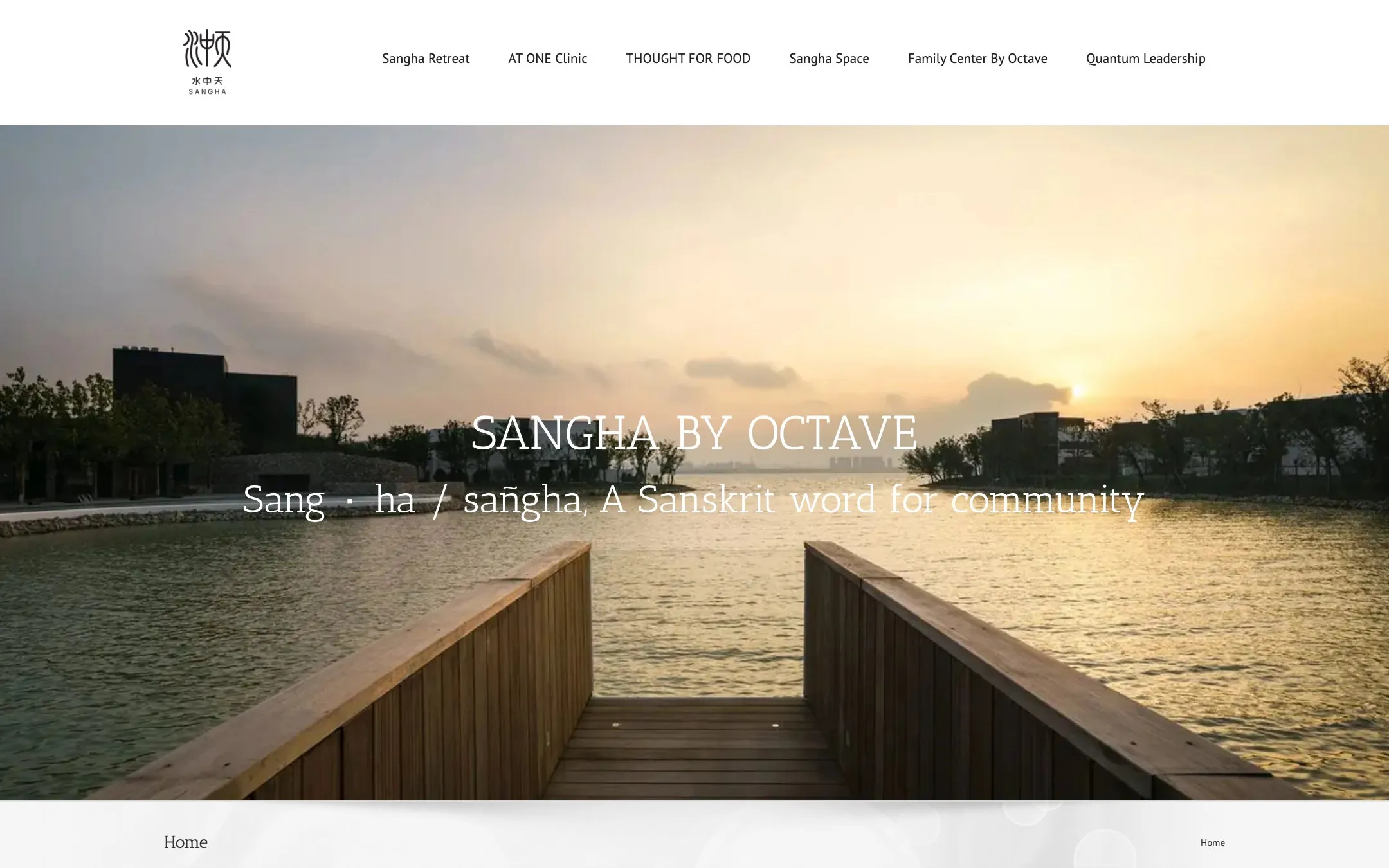
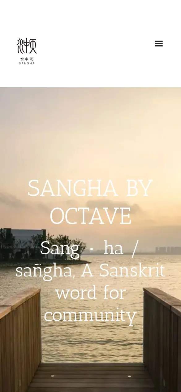
Sangha by Octave was a mindfulness program and mental wellbeing community. The name carries the concept: sangha is a Sanskrit word for community, and the site opens by saying so.
Leading with the meaning of the name was a deliberate choice. A brand built on an unfamiliar word has two options — hope people look it up, or explain it immediately and turn the unfamiliarity into an asset. Defining sangha in the first thing a visitor reads does the second. It sets an expectation of care and intention before any product or program is described, which is precisely the register a mindfulness brand needs to establish early.
The visual approach was built around restraint. Wellbeing brands are crowded with visual noise — gradients, stock serenity, motion for its own sake — and the effect is usually the opposite of calm. Generous whitespace, quiet typography, and a slow visual pace let the brand feel like what it is selling. For a category where the product is a state of mind, the site’s own texture is part of the argument.
The build carries a substantial image set, which for a community-oriented wellbeing brand does specific work: it shows real people and real gatherings rather than abstractions, and communicates that this is something you join rather than something you consume.
This project is presented here from an archived capture. The original site is no longer operating at its own domain, so the version shown is a preserved copy rather than a live commercial site — the archive link is provided for reference only and is not a working business. We have kept the project in the portfolio because the design work stands on its own and represents a category of brand work worth showing.
Community brands also face a specific credibility risk. Wellbeing is a category crowded with claims, and visitors arrive with a degree of scepticism that a polished surface alone will not overcome. Leaning on real imagery of gatherings and people, and on plain language about what the community actually is, does more to establish trust than aspirational copy would have.
Related projects
Treemasters
A new website for a Marin County tree care company built around ISA-certified arborists and licensed, insured work.
View case study → Web DesignPoint Lobos Vacation Rentals
A booking-focused site for historic beachfront cottages and a private ranch home on the Carmel coast.
View case study → Web DesignGary Marsh Design
A landscape design portfolio refined across a partnership spanning more than seven years.
View case study →Let’s talk about your project.
Tell us your goals, or book a free consult call — no pressure, no obligation.